Search: Digital Future

Tuesday 14 December 2010

eMarketer Research Reveals Marketers Buy In to Promoted Tweets

This is a recent artcile found on eMarketer.

Twitter advertising is attracting more interest from marketers.

In November, the TWTRCON conference and oneforty, an online directory for Twitter tools, surveyed 110 business professionals, mostly from marketing and communications, about their interaction with Twitter’s Promoted Products suite.

Overall, the respondents were interested in using Twitter ads as a part of their marketing mix, with 51% of respondents somewhat or very interested in Promoted Products. However, 27% hadn’t made up their minds and 22% said they had no interest at all.


The survey also noted that many brands and marketers are waiting to see the return on investment and business effect of such programs before getting involved. Buying a Promoted Trend adds the brand or product to the top of Twitter’s Trends list; Promoted Tweets give prominent placement to tweets from the advertiser. A third ad format, Promoted Accounts, includes a branded account among the other accounts Twitter suggests a user should follow.

At the Web 2.0 Summit in San Francisco in November, Twitter co-founder Evan Williams said using Promoted Trends increased the conversation around a topic by three to six times, and that most advertisers return after they have tried the format. Recently, Radio Shack sponsored the Promoted Trend #IfIHadSuperPowers, and Pillsbury used Promoted Tweets to discuss holiday food and recipes.

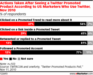
Twitter users are starting to take notice of the ads. The TWTRCON-oneforty survey found that 37% of respondents have clicked on a Promoted Trend and 29% clicked on a Promoted Tweet.


However, Twitter has a lot to do to catch up to other popular ad formats. Only 11% of the TWTRCON-oneforty study respondents said their organizations had used Twitter’s Promoted Products so far, while 59% were using Google AdWords and 55% used Facebook ads.

In a survey of ad agencies conducted in Q3 2010 by STRATA, 87.9% of respondents said they were likely to use Facebook advertising; less than half as many thought they would use Twitter ads.

Monday 13 December 2010

Facebook Relationships Visualised

Here's a great image of Facebook's visualisation of its connected global relationships from Mashable.


Ben Parr's original Mashable article looks at how this social graph was put together:

Facebook Intern Paul Butler was interested in the locations of friendships, so he decided to create a visualization of Facebook connections around the globe. How local are our friends? Where are the highest concentration of friendships? How do political and geological boundaries affect them?

Butler started by using a sample of 10 million friend pairs, correlated them with their current cities and then mapped that data using the longitude and latitude of each city.

That was the easy part. Creating the right effect to show connecting relationships between thousands of cities proved to be a challenge. Butler wrote a fascinating Facebook note explaining some of the challenges he faced creating his visualization:

“I began exploring it in R, an open-source statistics environment. As a sanity check, I plotted points at some of the latitude and longitude coordinates. To my relief, what I saw was roughly an outline of the world. Next I erased the dots and plotted lines between the points. After a few minutes of rendering, a big white blob appeared in the center of the map. Some of the outer edges of the blob vaguely resembled the continents, but it was clear that I had too much data to get interesting results just by drawing lines. I thought that making the lines semi-transparent would do the trick, but I quickly realized that my graphing environment couldn’t handle enough shades of color for it to work the way I wanted.

Instead I found a way to simulate the effect I wanted. I defined weights for each pair of cities as a function of the Euclidean distance between them and the number of friends between them. Then I plotted lines between the pairs by weight, so that pairs of cities with the most friendships between them were drawn on top of the others. I used a color ramp from black to blue to white, with each line’s color depending on its weight. I also transformed some of the lines to wrap around the image, rather than spanning more than halfway around the world.”

With a few more tweaks, he eventually came up with the amazing visualization you see here. At first glance, it provides some expected data — the U.S. has the highest concentration of Facebook friendships, and Africa has the lowest concentration. While most of Russia and Antarctica are nowhere to be found, the rest of the world is easily identifiable.